

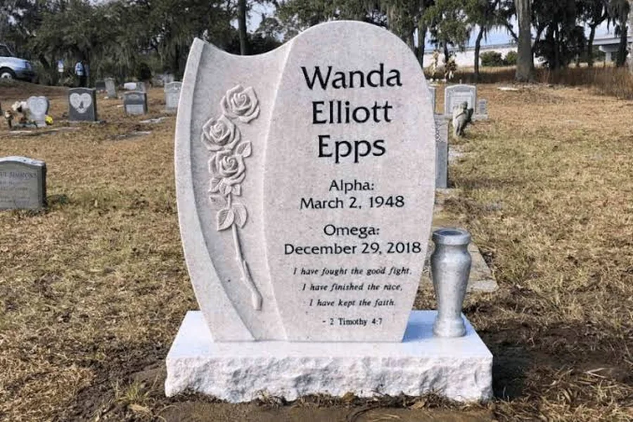
Two headstones can have the same dimensions and still make very different impressions. One may be easy to read from several steps away. Another may invite a closer look at a photograph or a carved flower. Much of that difference comes from the relationship between the stone, its surface, and the lettering.
Choosing a color is therefore partly a question of appearance and partly a question of how the finished memorial will work. A favorite sample is a useful starting point, but it cannot answer every question about a name, a portrait, or a long inscription.
The best way to evaluate granite is to look at it as the background for a specific design. Bring the wording into the discussion early, ask to see comparable finished work, and consider the whole monument rather than an isolated color square. That approach makes it easier to understand why a design that looks attractive on a screen may need adjustment before it is carved.
Look beyond the color name
Names such as gray, pink, or black describe broad visual families. They do not show you the exact grain, variation, or surface appearance of a particular piece of stone. The grain and small shifts in tone are part of the material’s appearance, so compare real examples of the stone rather than choosing from its color name alone.
Ask the supplier for photographs of the specific granite offered, ideally including a close view and a complete finished monument. A close view reveals the pattern; the wider image helps you judge how that pattern reads at a distance. Both are more useful than a tiny swatch alone.
Screens add another variable. A phone set to a warm display mode can make the same photograph look different from a desktop monitor. Outdoor light and a wet surface can also affect what you see in a photograph. Treat online images as references, and ask what level of natural variation to expect.
If matching an existing family memorial matters, explain that at the outset. Send several clear photographs and any original purchase information you have. Ask whether the supplier can identify the material or offer a reasonable visual match. A similar name in a catalog does not establish that the stones will look identical.
Make the lettering part of the material choice
People often select a stone first and think about lettering afterward. Reviewing them together can prevent disappointment. A highly patterned face and a delicate letter style may compete for attention, while a simpler background may allow finer details to show more clearly.
Ask to see examples of your proposed lettering method on the proposed color. A photograph of bold lettering on a different material does not demonstrate how your own inscription will appear. The relevant comparison uses similar letter size, spacing, and treatment.
It is also worth asking how the letters create contrast. The appearance may depend on the cut surface, a prepared panel, a contrasting treatment, or a combination of methods. Have the maker explain the actual process and any future care it requires. Avoid assuming that every photograph showing bright lettering represents the same technique.
A useful question is, “What would you change to make this name easier to read on this stone?” The answer may involve widening the spacing, using a stronger font, simplifying a border, or changing the arrangement. Those adjustments can preserve the preferred color while improving the result.
Understand what a finish changes
A finish affects the surface you see and touch. A polished face can look quite different from a rougher edge on the same memorial. Ask which surfaces receive which finish, including the back, sides, top, and base. Product photographs usually emphasize the front, so they may not answer those questions.
Different finishes can be combined intentionally. For example, a family might prefer a smooth inscription area with a more textured perimeter. The value of that choice is visual and personal; it should not be described as automatically better than a simpler treatment.
When reviewing Upright Headstones, compare how the tablet and base work together as well as the color of the main face. A broad base, a rough edge, or a polished border can change the apparent weight of the design even when the inscription stays the same.
Ask for a written finish description with the quote. Terms used in conversation can be interpreted differently, particularly if several reference photographs are involved. A clear specification should make it possible to identify which surface is smooth, which is textured, and where the inscription will sit.
Plan for the name to remain the first thing people notice
A memorial usually has a natural reading order. Visitors see the name, then the dates, then the smaller personal details. You can change that order deliberately, but it helps to know what the initial design is doing.
Try looking at the proof briefly and then looking away. Which element stayed with you? If the answer is the decorative border rather than the name, consider whether that matches your intention. A stronger name panel or a smaller ornament may improve the balance.
Long names deserve particular attention. Reducing every line to the same small size can make the design feel crowded. Ask the designer to explore line breaks, spacing, or a different arrangement before shrinking the letters. A middle name may sit comfortably on a separate line if the family likes that treatment.
There is no single font that suits every memorial. What matters is the finished letterform at the intended size. Look closely at similar characters, thin strokes, and decorative flourishes. If relatives include people who find small text difficult to read, make their experience part of the design review rather than an afterthought.
Give artwork enough space to be understood
A rose, a fishing scene, and a detailed portrait make different demands on the available surface. A design that handles one small symbol well may not support several detailed images at the same scale. Ask the maker which details will remain visible in the proposed technique.
For a portrait, supply the clearest original image available. Explain which features must remain faithful, especially if the background needs to be removed or the photograph restored. Request a separate review of any changes to the face before approving the complete monument layout.
For a simple emblem, concentrate on the outline and placement. An image can be meaningful without dominating the inscription. A small oak leaf might recall a person’s garden more naturally than a large generic landscape selected only because it fills the space.
Leave enough room around the artwork for it to read as a distinct element. If a vine touches the name or an emblem crowds the dates, the entire face may feel busy. The solution may be to remove one decorative feature rather than enlarge the monument. A thoughtful edit can improve both clarity and proportion.
Consider the setting without trying to predict every condition
If possible, visit the grave at a time when family members are likely to return. Notice the direction of approach and whether the area is generally shaded or open. Share those observations with the designer, particularly if readability from a path is important.
You do not need to model every season or choose a stone solely around a particular hour of sunlight. The aim is to avoid reviewing the design as if it will always be seen in a brightly lit showroom. Ask for ordinary outdoor photographs of comparable work, not only close promotional images.
Nearby family monuments can provide a sense of scale. Measure only with the cemetery’s permission, and use the cemetery’s current written requirements for the actual order. An older monument’s size or finish may not be an available option for a new installation.
Also think about flowers. A tall arrangement placed directly in front of a smaller inscription could obscure it during visits. If the design includes vases, review their placement alongside the name and dates. The memorial should still look balanced when the vases are empty, because that will be part of its ordinary appearance too.
Ask sensible questions about future care
Before ordering, request care instructions for the exact material, lettering, and any portrait component. A recommendation for plain granite may not cover a separate image plaque or a contrasting treatment within the letters. Save those instructions with the purchase record.
Avoid choosing a finish because someone describes it as needing no care forever. Outdoor memorials remain exposed to their surroundings, and appearance is influenced by more than the stone itself. Ask what the warranty actually covers and which tasks belong to the cemetery, installer, or owner.
The National Park Service cautions against harsh methods when caring for historic grave markers. For a newly purchased monument, start with the maker’s instructions and the cemetery’s rules before using any cleaning product. Do not experiment on the inscription to see whether a household cleaner improves its contrast.
If the stone moves, leans, or develops a problem at a joint, contact the cemetery or a qualified monument professional. That is a different issue from surface dirt. Choosing a color and finish thoughtfully does not remove the need for appropriate installation and occasional professional attention.
Review one complete combination before you decide
At the end of the selection process, bring the decisions together in one proof and specification. Confirm the granite, finish on each visible surface, lettering method, font, artwork, and dimensions. A collection of separate emails can leave room for a combination nobody intended.
Ask another reader to review the design without explaining it first. Can they identify the name easily? Do they understand the main image? Is any line unexpectedly difficult to read? Their response can reveal practical issues that become less obvious after you have studied the proof repeatedly.
A successful choice does not require the darkest stone, the most polish, or the largest lettering. It requires those elements to work together. When the name is clear, the personal detail feels appropriate, and the material suits the family and setting, the design has a sound foundation for approval.
